Showing posts with label infographics. Show all posts

Friday, March 16, 2012

Wozzilroy Twitter Account Showdown, the Infographic

awesome DIY infographics
For the full size infographic, click HERE
They've been an item since last summer. Young, rich, and at the top of their respective games, Rory McIlroy and Caroline Wozniacki are clearly a power couple... "a match made in sports marketing heaven", some have said.

Previous golf/tennis pairings - Martina Hingis and Sergio Garcia, Ana Ivanovic and Adam Scott, Chris Evert and Greg Norman, to name a few - have made a modicum of news, providing good back stories during major events like Wimbledon or the Masters, but... truth-be-told... these love affairs didn't much register beyond the rarefied radar of their respective niche sports.

The Wozniackilroy romance however, has the potential to transcend both golf and tennis thanks to the second nature social media skills of the two appealing protagonists. Their numerous celebrity hybrid names and recent appearances together at parties with the likes of Ronaldo and the Beckhams testify to the couple's growing social media sports star status.

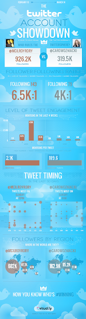
Rumor has it their initial flirtation was conducted on Twitter, and there can be little doubt that both @McIlroyRory and @CaroWozniacki appreciate the value of a timely tweet, but how do they stack up against each other?  Well world rankings-wise, Rory is currently golf's world No.1, while Caroline... who held the No.1 spot in tennis as recently as January... has recently tumbled to No.4.  But who reigns supreme in terms of Twitter temerity? Well, I can tell you that... and I can present it with a colorful, graphically sophisticated visualization thanks to new infographic creation tools from visual.ly... and it looks like Rory's dominating in the Twitterverse too. For the moment. I have a distinct feeling that the fiercely competitive Caroline will be back to  No.1 in the Tennisphere before long, and... who knows... after seeing this perhaps she'll decide to challenge her boyfriend for supremacy in the Twittersphere. In any case, I'm guessing the #Wozzilroy hashtag will be a popular this year.

Follow @CaroWozniacki and @RoryMcIlroy on Twitter.


Friday, August 19, 2011

Awesome Infographics - PGA Championship Visual Overview

Infographic by BlueClaw for Direct Golf UK
Before the final major of the PGA Tour's 2011 season is relegated to the golf history books, you'll want to have a look at the attached infographic, created for specialist golf retailer, Direct Golf UK by the creative folks at Blueclaw Media


If you read this blog you know about my obsession with infographics... and golf infographics in particular.  Professional golf is all about stories and statistics, so it lends itself perfectly to engaging data visualization.


Here, a brief history of the PGA Championship is presented in a graphical style that's fresh and whimsical. It includes some of the tournament's more remarkable players, venues and records, and takes us right up to Sunday's Keegan Bradley win. 


Next week the Fedex Cup playoffs begin, and I think we can look forward to seeing some more infographic creativity as the four event series unfolds.  

Here's the full sized version.


Monday, May 2, 2011

A Somewhat Sexier Look at the World Golf Rankings

Last week I lamented the dourness of the OWGR's website and their "just the facts ma'am" style of presenting data.

The subject of who actually is the #1golf in the world is generating quite a lively debate at the moment. One that would/could only be enhanced by some sexy visuals.  So with some help from my friends at IBM and their awesome Many Eyes project I've made a modest start at sexing up the stats.

Now the thing is... much as I love analytics, infographics and such... producing/explaining them is not my forte,  I'm more of a look at the pictures and turn the pages type, as the old song says.  But... someone's got to do it, so I'm making an attempt.

For my first visualization I decided to look at one of the more... um... contentious elements of the current discussion: Increased globalization and the end of U.S. dominance in men's professional golf.  For convenience sake I took an existing visualization made from 2007 data, and built the same one using current data.  This provides something of a baseline comparison.

It's not perfect.  I would like to have adjusted some of the perimeters and functionalities (probably not the right words) but I was working with a preset program and couldn't quite... figure out how to do it.  Check out the interactive diagrams at Many Eyes: the 2007 stats  and the current stats.  I'd be curious as to what you think.

I've got to admit I looked longingly at the big Tiger bubble on the 2007 model.

Tuesday, April 26, 2011

OWGR Needs to Serve Up Some Sexy Infographics


For the time being, the era of an ultra-dominant W#1 golfer is over.

This reality has opened the door for some bombastic opinionating thoughtful discussion on the system by which golf's top player is determined.

As Lee Westwood recaptured the top spot... then quickly grew weary of of the public polemic surrounding it... myriad opinion posts and countless Twitter debates have challenged the current point system or... extolled its virtues.
 
Some suggested there was simply too much nuance inherent in the game for any ranking system based strictly on data to be relevant ...which was kind of interesting until that post abrubtly ended with a facile quip on Luke Donald's recent fashion daring.

PGATour.com's Melanie Hauser wrote what I found to be the best breakdown of the current OWGR controversy, providing some historical perspective and finishing with a call to "sit back and enjoy the shuffle".  Which is definitely what I'll do. --->

I do have one suggestion for the OWGR that might go a long way towards making their rankings more engaging for a wider swath of the population... those like myself who just aren't that into raw data on who's #1: Have a look at the Rolex Rankings.

Women's golf certainly knows something about a shuffle at the top, but they don't seem to get bogged down by it.  And the Women's World Golf Ranking... the Rolex Rankings... do some extremely sexy things with their stats. They also provide a depth of information about the game that makes the battle for number one... and the trajectories of individual players... much, much, much more engaging than the bare-bones OWGR site.

The Rolex site is easy-on-the-eyes and interactive; fans can select favorite players and compare their progress infographically.  It's brilliant and I'm quite sure that if applied to the OWGR it would encourage... and enrich... engagement with men's professional golf. The tiresome discussion of who should, could, would be #1 is fine for hardened golf journalists/bloggers/scribes but the rest of us would surely appreciate a little infographic love.

Wednesday, March 30, 2011

GolfGirl Infographics - 2011 Masters, Early Picks


Infographics are awesome.  Marketers love them - that's a given - but so do regular folks, and these days they're everywhere; offering a whimsical visual representation of virtually anything,  from the cause of jet lag... to the cost of a latte... to the demographics of the internet.

At their simplest infographics are merely charts or graphs,  but they can also be compelling works of an illustrator's art. 


The Masters begins in a week and already it's THE major topic of conversation in golf. The tournament's distinctive history and unique traditions... combined with the wealth of statistics that come out of it each year makes it quiet "infographically friendly".

I've put together a quick word visualization infographic (above) based on early 2011 Masters picks (about 60). I culled them from predictions posted in the forum at sandtrap.com  and randomly on Twitter.  Yes, Tiger dominates, thus his name kind of stands out on the above. Phil Mickelson, Bubba Watson and Nick Watson were also popular, then came Dustin Johnson, Graeme McDowell ... and so on.  The tiniest names had only been picked by one fan as of Wednesday 4/30 PM.  The pie below can only accomodate a few of the top picks.  I must work on that.  Anyway it's a start.

I have a feeling I'll be creating a few more visual representations of the 2011 Masters before it's over.


 Also...

3 votes - Hunter Mahan
2 votes each - Lee~Westwood, Anthony~Kim, Rickie~Fowler, Rory~Mcilroy, Luke~Donald, K.J.~Choi
1 vote each - Sergio~Garcia, Miguel~Jiminez, Angel~Cabrera, Ryo~Ishikawa, Ian~Poulter, Ernie~Els, Alvaro~Quiros, Justin~Rose,  Ricky~Barnes, Mark~Wilson, Steve~Stricker, Retief~Goose, Francesco~Molinari